
Studio Exploration — Sailing & Charter
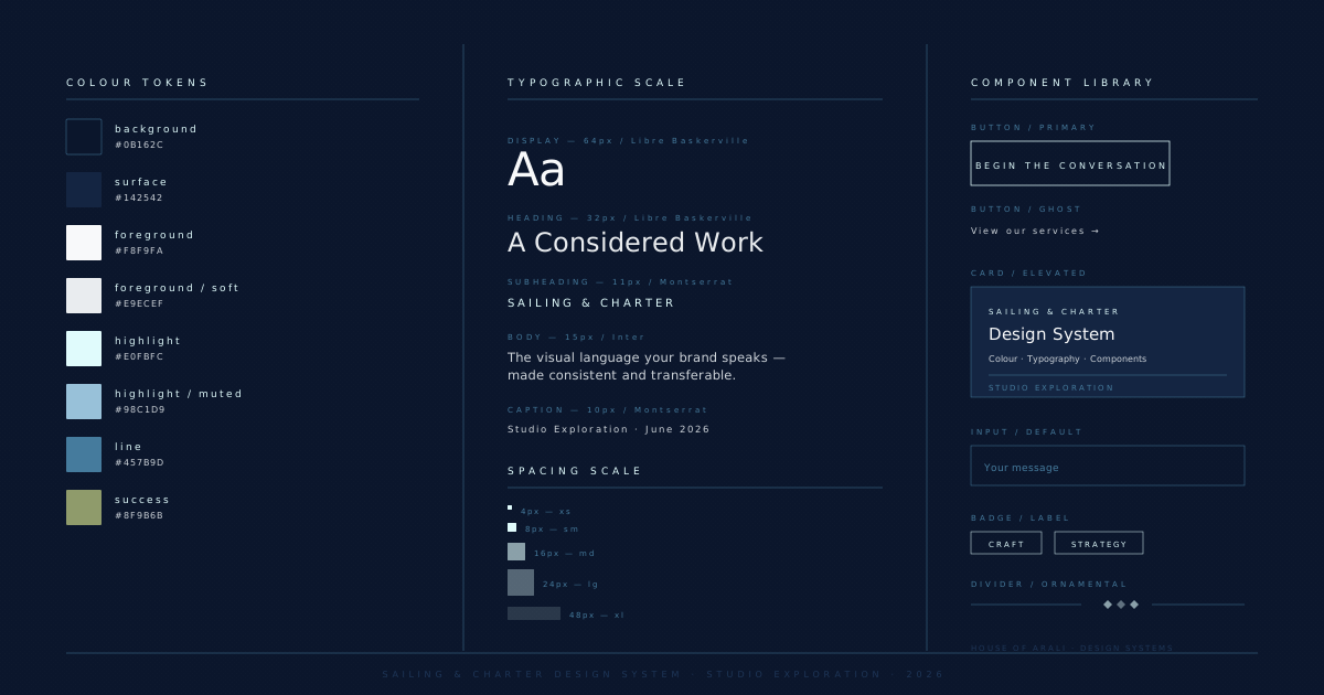
A design system for a luxury sailing and charter company: deep navy palette, typographic scale from Libre Baskerville to Inter, and a component library covering the full booking funnel.
The Brief
A luxury sailing and charter company with an established name on the water and no visual system to speak of. Every crew uniform, booking confirmation, and digital touchpoint had drifted into its own dialect.
What Was Built
A complete token architecture anchored in a deep navy and warm cream palette — reflecting the interplay of sea and sail. Typographic scale uses Libre Baskerville for headings and Inter for interface copy, giving the brand authority without stiffness. Component library covers the full booking funnel: enquiry cards, charter listings, crew profiles, and confirmation states.
The Result
A unified visual language across digital, print, and vessel livery. Brand guidelines document delivered with a worked examples section covering edge cases the team would encounter without guidance.